2/28/09

Book #059 - Doodling


I'm way late posting this, but I really did make the book yesterday - last night after dinner, sitting around at the table, in fact. We had an old friend over who moved from Seattle and hasn't sat down to dinner with us in a long time. After a few minutes it didn't seem long at all.

I have a 5-drawer rolling Iris cart tucked under the dining room table where I keep my upstairs supplies. (I end up working on the table most of the time anyway.) I found some tabbed notebook dividers, needle and thread and a few Sharpies. So that's what this book is made from. I doodled the cover a bit - don't know what it is. Just doodling. No scissors so I ripped. The spine is sewn and the cover is stuck over the stitching with doublestick tape..

And it isn't nearly as fuzzy as the picture makes it look!

2/27/09

Book #058 - Blank (blue) Slate


A uber-simple book for a busy day. You can barely see that its pages are two shades of blue and that it has a sewn binding. No separate covers...what you see is what it is.

2/26/09

Book #057 - Matchbox Doll

book book
A little book in a matchbox, a matchbox covered with origami paper and with a little doll inside. I cannot tell a lie -- I didn't make the doll today, I already had it. I had made the book in the box and that reminded me that years ago I made little dolls in matchboxes for Valentine's Day; I scoured around and found a few.

There is a book/doll set...

OK. I went off to double check the title of the book/doll set that I had in mind. It used to be for sale through the Metropolitan Museum catalog, but that's not important. What's important is that I ended up at the official website of Dare Wright, the author and photographer who created The Lonely Doll. I was blown away by the story of her life, and you might be, too. Here.

So long until tomorrow.

2/25/09

Book #056 - Album-like object


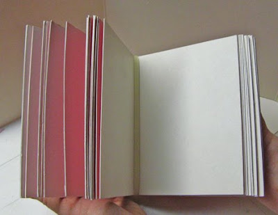
An album/envelope/picture and ephemera saver. Pages are 4.25 x 5.5 red, blue and cream; red and blue pages have slits to hold things by the corners and the creamy pages are folded to make pockets on one side; sixteen pages altogether; pamphlet bound. OK.

2/24/09

Book #055 - Post Binding


Post binding (aka post and screw, screwpost, screwpost binding) is often seen on manufactured scrapbooks and albums. There are two parts, the screw and the post (big surprise), and they come in a variety of lengths. Well, the post comes in different lengths; the screw is the same for all of them. This post is 3/8 inch long. Anyhow, you push the post through holes in your pages and covers and then whirl in the screw and that's that. This little round book has covers of painted cardstock and pages of heavy white paper, all 2" in diameter and cut with a big Fiskars punch. The copper colored dot in the screw is a bead added for decoration - the screw itself has a recess there.

I get these at the University Bookstore in Seattle, where they are sold by the set, so you can buy a single screw and post for about 20 cents. They have only the plain aluminum but you can find colored aluminum or plastic if you look around online.

2/23/09

Book #054 - Japanese ledger


A Japanese style ledger or receipt book, daifuku cho. Once very popular as a travel diary and as a guest register at inns, but most commonly as a merchant's account book. Daifuku means 'great fortune,' traditionally inscribed on the cover to encourage great fortune and success in business.

2/22/09

Book #053 - 158.1MAN2009


Well, I had an entertaining excursion through a whole lot of websites, from the Library of Congress to Library Thing, and all because I thought it would be fun to assign a call number to today's home-made, totally personal Self-Help book. It's a little book of a sort that I make for myself from time to time, when I want to generate some new ideas for rumination and art.

I take some free art gallery directories that I pick up at the museum whenever there's a new one, and I cut them up into small strips which I fold and staple together in a cover. The cover of the day is another piece of the Gymboree box left over from Christmas. (It's almost gone, thank goodness. I don't like yellow that much.)

When the book/s is/are all done, I go through with some colored pencils and highlight words or phrases that catch my eye or mind. Usually it's something I find thought-provoking as a subject, but it can also be something or someone that I want to follow up on. It's important that the pages be small, so that a single word can seem like a big thing. And I try to pick out only one thing per page (discipline being its own reward) but that doesn't always work.

What I highlighted in this book:

theatrical
humor
landscapes of the psyche
primavera
seriously funny
systemic
2-building complex
conversations between
North Beeline Hwy.
bannock
la Villita
clsd sun
the intersection of Palace Avenue and Cathedral Place.
Alameda St.
dieties, and cosmic narratives
tango with cows
European manuscript illuminations
red brick
superstition freeway
center for land use interpretation
discrete anecdotes in the over-arching story
artist road
arbitrariness of boundaries between different cultural practices
private enjoyment
rich colors
elaborately decorative patterns
belles heures of the Duke of Berry
tribal art
public always welcome
SITE
Rita Banjeree
Tanyth Berkley
Angelo Filomeno
reconstructing identity
commodus
uncertainty principle
lost and found
restoration
mano

2/21/09

Book #052 - Yellow Question With Music

The book (cover) is yellow. The book (pages) are music.


The question, which occurred to me as I was getting ready to cut the cover down to size, is: Is there any reason a book cover can't be larger than the pages? Are there any reasons why you might like a book cover to be larger than the pages?

I'm going to sleep on it.

2/20/09

Book #051 - Untitled

book
collage collage
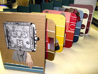
I can't seem to stop making dolls, even when I'm making books - or collages. So here's a book of collages of doll-like objects. I did it at the studio last night; it was Third Friday and there were some other folks there and a lot of cutting and pasting going on.

I do have fun with these particular paint samples. They're about 5x6 inches, a good size to work on. The color names add a special something. When there are 5 or so individual collages I fasten them to an accordion-folded spine and add covers. There's some extra spine at the top of these pages, so I may add another row of skinny collages (or text, maybe) there.

2/19/09

Book #050 - Suit


Full title:
'Suit - Travesty #2 on the work of the Brothers Grimm.'

As promised, another travesty. Eight pages of text from the Travesty Generator and illustrations from various websites of Silly Pictures, Stupid Pictures and Funny Pictures. Can you guess which Tale of the Brothers Grimm this one is based on? (The pictures probably won't help.)

I guess I was just in a silly-stupid-funny mood this evening.

2/18/09

Book #049 - French folds revisited


Yesterday's flash cards weren't the only thing I found at the Dollar Store that day; I found some interesting papers as well. I thought I'd try the French Fold book using paper with a border design, to see how the design arranged itself across the pages. I had my doubts about the oval, thinking the straight borders would work out best. Not so - I love the curves. These papers came in packages of 50 sheets for computer use. As is often the case at the $ store the quality was a little less so. In this case that was a fine thing as the paper is thinner and has an almost rice-papery feel to it.

And the image in the background was drawn on the outside of a great box of stuff I got in the mail from a friend. It's all that's left of the box, I couldn't let it go.

2/17/09

Book #048 - She So Pretty...


I found these flashcards at the Dollar Store the other day. I'm always on the lookout for unlikely stuff to turn into a book, and I have a particular liking for flash cards and game cards and such, but these cards were especially interesting in that they had two words to most of the cards and they weren't your run-of-the-mill words either.

No too-cute drawings of apple or kite - very few nouns at all, in fact - but lots of adverbs and adjectives and prepositions, with no pictures whatsoever. So there are ample opportunities to assemble silly phrases and odd combinations of words. Too cool! AND there were three different sets of these. More cool! I am so easily entertained.

Anyhow, I sewed one set into a book (the cards folded so nicely down the center) as seen above. The cover is minimal, just a piece of heavy cardstock glued at the spine. And those are the first eight pages. The story gets weirder later.

2/16/09

Book #047 - Tags and More Tags


Here's an assortment of little books made from shipping tags. From the top, going clockwise:

1. three tags taped together to make an accordion (or a screen?)
2. two tags with a paper spine glued on the short end, a small signature stapled in last
3. three tags tied together with one string - about as simple as it gets
4. the pages are stapled in the fold at the left, the other end of the tag makes a flap, and theres a button holding it shut through the hole
5. just like #2 but with the spine on a long side

center - tag folded in half, pages stapled in at left fold and the whole thing tied shut with the ends of the string

The strings can be used in a lot of ways: to hold the things shut, to attach embellishments or just to hang there and make it look tag-like.

Happy Presidents' Day.

2/15/09

Book #046 - Market Accordion


We were cleaning the basement today and I found this old poster of the Pike Place Market - not in the best shape, pretty wrinkled and somewhat faded. It wasn't worth keeping, but it seemed a shame to throw it away, partly because it was printed on some really nice, heavy watercolor-type paper. So, despite my intention to revisit the longstitch book again today, I decided instead to make a book out of the poster. You know what was the most fun thing about this book? It's bigger than usual. I'm starting to get tired of making 4.25 x 5.5 inch books, which is what you tend to come up with when you use standard size paper and card stock. The poster was a nice big 20 x 28 inches and I ended up with 7 x 10 inch pages - eight of them. (I cut the poster horizontally, folded each piece in fourths and then sewed the two pieces together.) It had a nice feel to it. The covers are cut from corrugated cardboard and painted a splotchy pale blue/gray/white - Seattle colors, you know. They're glued onto the two end panels. I like the way the stitching looks on the thick textured paper; I think when the day comes I'll add some more stitching to enhance - or maybe interrupt - the image. Or maybe I'll embroider the text. What text? Well, I'll think about it.

This might end up being a good gift for an ex-pat Seattleite.

2/14/09

Book #045 - an Unwoven Longstitch

A tidier take on a longstitch. I made the spine first, separate from the rest of the book. As you can see it has five rows of holes (for five bundles of pages - aka "signatures") and six holes each. The holes show up better on this side of the cardboard, which was cut from a used Priority Mail box, but on the other side are all the measuring lines and marks. They show up further down the page. I used the finished spine to locate the holes on each signature, marked with a pencil then poked with a pushpin. When everything had all its holes it was an easy matter to stitch them together. (Remember Sewing Cards?)


The thread broke once, that was a nuisance but I just un-sewed it a bit and tied on an extension; you can see the knot. All the pages were neatly attached to a sturdy spine, ready to be joined to a cover of some sort. Now, the beauty of doing things this way is that the structure of the book is established and you can make the cover out of any number of sensible to ridiculous things - it's just there to protect the pages, not to support the book in any way. You can just glue it into a folded sheet of paper or card stock, as shown, or you could use fabric, or leather, or an interesting cover that you ripped off of an old book. You could glue the spine to the wall and never misplace the book.


There is one further refinement that would make the inside of the book look nicer; maybe that will be for tomorrow.

2/13/09

Book #044 - Woven Longstitch (Improvised)


Very 70s looking, n'est-ce pas? Reminiscent of all that macrame, which I actually wasn't into back then.

What's going on here is two things: first, a woven long stitch. This is simply a long running stitch that attaches the signatures to the spine of the book, basting it, as it were. See the red drawing below. After the basting is done you take the long leftover ends (leave some at the beginning) and weave them back and forth through the basting threads to make a nice, tidy woven decoration on the spine. At least that's what happens when you make the same number of very evenly spaced holes for each signature.

But who wants to do that when you can make different numbers of randomly-spaced holes and improvise a 70s-style macrame/woven/buttonhole-stitched spider web? That's the second thing. (See the blue drawing above.) Making things up as I go along is my idea of a good time, and this required a lot of that so I had a real good time! (So good that I went to bed exhausted and didn't post this until 12 hours later.)

The cover is just one folded piece of paper, the contrasting pieces were glued on later. This is a very simple style of book if you are comfortable with a hand sewing and improvisation.

Here's a picture of a very precise and beautiful (unwoven) longstitch binding, lest you feel that I'm setting a bad example for you. It is pretty, isn't it?

By the way - no matter how many or how crooked, you need an even number of holes in each signature.

2/12/09

Book #043 - Exercises in Asemic Writing

Asemic writing. It looks like writing, but you can't quite read it.

Today's book is more about the content than the construction, for a change. Asemic writing is writing that...isn't. It looks as if you should be able to read it but...you can't. It appears to make sense, but...no, it doesn't. Or does it? Here are some examples that I came up with for today's book with explanations of how they were done. If you want to read up on asemic writing you could start here.

The text above was made by slicing a printed page from a book and then reassembling the slices. In this case the cuts were made horizontally, through the center of the lines of type, so that the letters were split in two. Then the strips were mixed up and offset a bit - however it looked good - and glued back together. The whole thing was then scanned and tidied up in Photoshop; all the little leftover bits being removed.

The two on the left were made the same as the above example, except that the strips were cut vertically so that the the individual letters were preserved and recognizable; the combinations of strips resulted in random mixing of parts of words, creating something that looks like our alphabet but not a familiar language. To the right, circles and rectangles cut (punched, actually) from some pages were glued onto a whole page, breaking up the print in a completely random way.


And finally, the above example was done in Photoshop, using the same principles as described above. I created a line of test and then cut and copied and reassembled it. Lastly I used some shape-distorting tools on it.

You know you can enlarge the images by clicking on them, right?

2/11/09

Book #042 - ahead of its time


A simple book for a long and arduous day.

Book 42 does not contain the answer to the Ultimate Question - it's a self portrait deco. It has white cardstock pages and a tan cover sewn with a pamphlet stitch. There's room for seven contributors; everyone gets a two page spread - a whole face. I'm sure that no one I know has a head shaped quite like that, but these are imaginary - or maybe imaginative - self portraits.
As the host it's my job to do the covers, and you can see I've started a little pencil experimentation. (What am I going to do with that string coming out of my nose?)

Anyone want to play? It will fit in a #10 envelope, I think...until it gets too thick. Leave a comment or email me (liisa at liisa mannery dot com). I have two people so far.

Late. Tired. 'Night.

2/10/09

Book #041


This book was done at 9PM. It truly was!

Then I started looking for a blog widget that counts down days. And now it's 2:17AM!

So here is a scan of the front of today's book. I know, it looks like a square of paper, but it is a book front. The pages are a cream colored card stock, staggered as on Day #030, and the covers are this brown and pink dotted paper that I can't seem to get enough of these days. The whole thing went together in about 15 minutes. Nice book.

2/9/09

Book #040 Kiss-A-Me


I never get tired of paint samples, especially the names. The best names are the ones that have nothing to do with color; the very very best thing is a whole strip of colors - with no name having anything to do with color. The samples here are all colors of love, romance, kissing, sighing...

The construction of the book is probably obvious: a heart-shaped accordion with glued on covers. The ovals are punched out of paint chips - names included. They are slipped into slits in the pages and then embellished with more color names and shapes. The edges of the pages are brushed with iridescent watercolor...it looks much more shimmery and subtle in person.

2/8/09

Book #039 - a PDX Gluebook


Book #39 is a just-for-fun gluebook. It all started with some tourist literature from Portland Oregon that I couldn't quite get rid of. I ripped up the map to make wide narrow pages then glued other bits and pieces to them. Lastly, I scribbled - my own comments and memories but, even more so, Gordon's comments and memories about his home town. It was an nice way to pass an evening and I heard some good stories and learned a few things. Gluebooks are good therapy, too - spontaneous cutting and pasting - nothing too serious.

The pictures are the front cover and 1 (plus a little more) of the 12 pages in the book.

2/7/09

Book #038 - a Highly Experimental...Experiment

book detail side detail spine
Also highly pink. It just happened that way.

This all started because I had a cereal box, a raisin box and another cereal box that nested just perfectly and I thought it would be cool if I could find enough of the right sized boxes to make a whole book that way. And I might still, with 327 days left in the year. But I did (and still do) have a whole lot of identical pieces of cardboard - hot pink glossy on one side - left over from a previous life, and they're already scored for folding in one place. And I have a LOT of them. Sooooo...

I decided to try out the idea using the hot pink cardboard. It was instructive, as an experiment. Cutting 16 pieces all exactly the right size (2.5 mm smaller each side, each time) was a challenge, as you can easily see in the photos. When I got to the end the original binding idea was obviously not going to work. I tossed around a few ideas and settled on cable ties: two biggish ones to hold the pages together, and two more tiny ones to hold the ends of the biggish ones together. They are easily enough removed if I get a better idea down the road.

I have mixed feelings about this book. It was interesting, but I don't really like it all that well. It's not a lot of fun to put together - far too little room for error to suit me - and the results are...meh. It's heavy, too. But one of these days (like maybe next October) it will dawn on me why this book needs to exist, and then it will become one of my favorites. I'll betcha.

2/6/09

Book #037 - Red Envelopes for the New Year

book
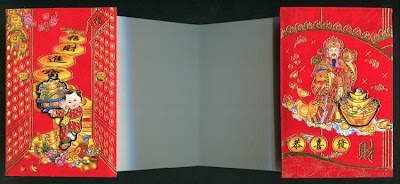
I had some of these Red Envelopes left from the Lunar New Year. Happy Year of the Ox, by the way. They were the perfect size for a small book cover, and I thought I could just slip a piece of cardboard inside to stiffen things a little, and then glue them to the ends of an accordion-folded page block. As it turned out I decided instead to slit the back of the envelope and slip the end panel of the accordion inside the envelope. It stays nicely with no gluing - always a plus in my book. (Ooh, no pun intended , really.) The accordion is cut from a big sheet of watercolor paper that folded up just right to make 12 perfect size panels. So...you've probably guessed that it's going to be a book about the 12 animals in the Chinese zodiac. I already have some faux postage from New Years past...so that's a start.

The envelopes are not only very RED, but the paper has a velvety surface that is just a bugger to photograph - reflects light all over the place. And all that gold! Actually the gold turned out surprisingly well in this scan; metallics are normally impossible. Anyhow, it looks better in the blow-up so please click.

Gung hei fat choi!

2/5/09

Book #036 - Pseudo Belgian


Well. This is my new Favorite Binding. It could be called a variation on a Belgian Binding - that kind of variation that happens when you're trying to do something from memory and can't quite remember how. The covers and spine are three separate pieces that are sewn together. OK, more like woven together - the spine just sits there with the threads passing over and under it. The pages are added last, at which point the whole thing comes together as a single connected whole. It's hard to describe, but it really is very elegant. I think its greatest virtue is that, although there are several steps, you do them one at a time, and none is really what you'd call difficult. So overall it's very easy. I like this book a lot.

Thus far it's empty (the pages are a pretty paprika-ish color) but there seems to be a theme building. The binding is Belgian (sort of) and the thread I used to bind it is Belgian linen (a coincidence) and I was watching PBS while I worked and lo and behold - Poirot! (He was Belgian, mon ami.) So...a book of Belgian? Horses? Endive? Lace? Audrey Hepburn?

Oh, and the window on the front cover is just the top layer of the corrugated board carefully removed to expose the flutes.

2/4/09

Book #035 - Black and White and White and Black

Book #035

A four signature case-bound book. (What some folks call a "real" book.) The covers are made from some topological maps of the Skagit Valley; pages are cut from a tablet I bought at SightConnection.

SightConnection is the retail store of the non-profit Community Services for the Blind and Partially Sighted
. They have a brick and mortar store near Northgate (in Seattle) and also a website here. Even if you don't have diminished vision you'd probably like some of their products. I go there for tablets and notebooks and really nice, functional calendars. They also have a big selection of magnifying glasses that always tempts me. Lots of other stuff, too. Check them out.